Wednesday 11 May 2011

The creation of layout derived from a stronger form

Consistant research and analysis of the target user for the site initially prevented a form to speak the volume of the concept. The initial process on form arrived at a flat and disjointed structure non-representational of the concept theme.
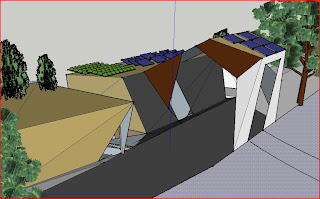
Further understanding of the programming and biological inspiration has delivered me to a form of movement and representation. Themeing spaces around the idea of public permeability and defined user accesses reaching to connect with thoroughfares, existing buildings and views from and to site.
Below is a sketch impression of the form


I will develop the form further to understand how tectonic effects the structure and desired representation and linkages as mentioned earlier.

Monday 2 May 2011

Contextual Parameters

Whilst I have completed alot of analysis to this point and made a link to the site with my preferred user (homeless persons of brisbane), my design and continuation of the folie is further developed within this next level of analysis through an understanding and direction for the contextual parameter of the design.

For this I have looked at creating usable spaces for solitude and safety from voids within structures. Looking at a link between how voids in the city framework is used to 'accomodate' homeless persons today, I will develop the design to create usable economic and social areas within the site containing voids that will be filled with a functionality relating to the needs of homeless persons within brisbane. Providing a safe and comfortable haven for solitude, reflection, connection and opportunties.

As will be shown in Thursdays presentation, the program for design of this space has come about through research on the needs of homeless people and how service systems and authorities aim to break the cycle and create an opportunity for persons to seek an improvement in their living conditions and outcomes.

Wednesday 20 April 2011

developing a program and method of mimicry

The goal of this proposal is to create an untangible gain to a human occupant with a side-effect of aiding the natural environment.

Breaking the cycle of homelessness, creating opportunities, assistance, sustenance, safety and development is the desired program. The physcological well-being and preservance of dignity of the occupants must remain cognisant (sp) in the work of the designer. Ultimately, this breaking of cycle is a gradual process.

To mimic nature in the built form in relation to this topic I have drawn an analogy to the strangler fig. Whilst the naming of the fig is unfortunate to the building purpose, the ideaology is right. A grand form is created by interacting and relying upon those around it.

I have made the following diagram showing the basic fig cycle:


I have taken this theme coupled with camoflague and decoy and created a basic model to describe the basic form - however not material descriptive.


Saturday 16 April 2011

Animals and Camouflage

I would like to further develop my idea within the site of Howard Smith Wharves of seperation and solitude by using the principles of camouflage and mimicry. Providing a space of refuge within the city camouflaged from interpretation by passers by and effectively detached from the surrounding urbanity I am keen to understand the principles of camouflage in nature and the relationship with human occupation.
After reading an article on homelessness within Brisbane, I believe my concept plan correlates with the issues of homelessness by providing a space of security, un-comprimised, addressing the issue of lack of suitable shelter and most importantly providing opportunities to develop without preditation or interferance.

Below is a

Thursday 14 April 2011

Separation by blending

I will be developing my design along the theme of urban seperation for the purposes of reflection, regeneration and perhaps a space to provide a healing for mental health. I would like to create a space that uses the site but is hidden within the site or camoflauged, using the idealism "can't see me, cant affect me".
I will be doing research into the methods of camoflague both in the natural environment and urban context. Naturally, mimicing the concepts of nature and the use of camoflague in habitat for animals and the effectiveness and principle behind the camoflague. In this sense, animals also utilise bio-mimicry to create safety in their habitat.
In developing my research on this topic I have also come to recognise decoy as a method of camoflague or protection.


a flounder blending with the sea bed, there and effective but hidden the therefore protected

Tuesday 5 April 2011

two-lane highway

Concurrent research on the design of solitude and bio-mimicry.

This lecture has been a great start for me on understanding the greater elements of biomimicry.

http://biomimetic-architecture.com/2011/02/18/michael-pawlyn-of-exploration-on-biomimicry-applied-to-architecture/

The Sahara Forest Project


Source: exploration-architecture.com/section.php?xSec=35  (accessed April 3 2011)

An approach to seperation and solitude

Following on from Yvonnes notes on my reflection towards the site and design intent, I have been prompted to take a closer look at my idea of seperation and seeking solitude in the proposed site. How is the desired effect of solitude achieved or sought phyically, emotionally, psychologically, philosophically and experiencial? How does the folie insertion manifest, consolidate and express across each layer or entwined between layers?
I will attempt to provide my own personal definitions/solutions to the questions posed. From my own experience without reference to external sources.
Define solitude in a physical sense: to be alone, unaccompanied, self directing
in an emotional sense: calmed, centered, non-communicative
psychologically: at peace, rested, single minded, focussed
achieving solitude philosophically? To have an idea of solitude based on the before mentioned criteria. I'm a 'realist', to be philosophical is uncomforable for me!
experiencing solitude: is a about a journey, the channels of approach to seeking solitude in an emotional, physical and psychological sense enhance and in some cases create the greater out come of solitude.

So based on these personal interpretations of solitude/seperation, how was it formalised on site. A retrospective of the design approach leads me to a greater understanding of why I chose the theme of the folie and specific site. The experience of solitude is the first effect. Travel the path of least interaction and 'happen upon' the folie. Discover an alcove of privacy in a site of the opposite and seek an emotional reaction to the void within. Upon entry, vision is restricted to framed views. A physical position of 'back to the world' coupled with perched above.

I see a pattern building here discovery journeys, position, entry and effect and impact on user.

Thursday 24 March 2011

The Folie

So in my original (that went AWOL in cyberspace!) I wrote about the site and context that was relevant to me. To recap, I found the Howard Smith Wharves an unusually eerie place, and I say unusual, as you would expect a position within the city limits, beneath a major thoroughfare to be noisy and in some respects a hive. Not so for me.
I understood the boundary street entrance to the site to be a 'buffer' or barrier between the CBD and Fortitude Valley and with the surrounding residential, hotel and education facilities, the site carried an almost relaxed, emotional seperation to the surroundings.
This feeling, coupled with an understanding of Folie (Beyond Representation) provided me with a context of seperation and reflection and thus a movement towards the design concept for my proposed folie insertion.
The end result to my folie concept and design exploration and realisation was one of  conflict : : solitude and to create a space in a conflicting site of solitude.
But how does a user experience solitude? Well, solitude is defined differently for every person, for this instance I believe it to be a quiet cool space fit for privacy, yoga, reading, writing, completely seperate from the life outside.
So how do you achieve a place of solitude in the city scape? My interpretation of this was to 'block out' the city and traffic and concentrate on framing what is comforting/relaxing, a frame to be voyeristic. And this then led to framing the river whole. Creating a space that (unless sought) the city and surrounds are excluded from site and the user concentrates on the lulling effects of the water and vessels.
I discovered that view framing was best achieved in a high position away from interuption. The path leading from Ivory St, between the two accomodation towers and towers New Farm was a perfect opportunity to tuck away a folie for this purpose and turn the back on activity. And better still to utilise the cliff face and create a greater experience of seperation.
Architecturally, I expected the folie to be of simple construction, minimalistic, plane materials, not a blight on the cliff face. Reinforced concrete, canter-levered to the cliff was explored to be most suitable, but I experienced not connection to the site using soley concrete. The insertion of timber peices, eratically (sp), allowed for an absorption into the site whilst enhancing the occupiers experience of being hidden beneath the materials.

Mark II

Attempt number two at commencing a blog for Archi 5... Enjoy!